
Expanding Headspace's functionality to be more inclusive of diverse lifestyles and personal needs.
Design Innovation Extracurricular Project
February - May 2023
Overview
Over the past few decades, we have witnessed a growth in mental health initiatives and awareness. Despite the increase in resources, we find that mental health continues to decline where as much as "one in five American adults experienced symptoms of anxiety and depression in 2023" (CDC). This phenomenon can be traced back to gaps between these resources and their respective availability and usage.
Headspace is one of the leading meditation apps on the market due to their expansive library of meditation content. They claim that their library of meditation guides can reduce stress by 14% in only 10 days. However, their mental model requires their users to treat meditation as a daily habit. We see opportunities to make these resources more approachable to the general public.

01: Understanding the Problem Space
The Toolkit
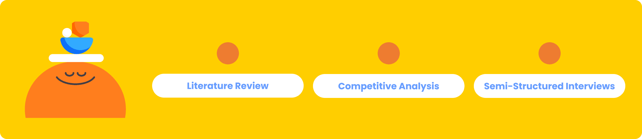
Literature Review
Although three members of our team did have psychology backgrounds, it was important for us to complete secondary research on the mental health landscape. Our relevant findings:
Mindfulness and meditation techniques do work. Researchers have proven that using these techniques can improve stress, anxiety, and depression as well as linked functions, such as attention and sleep.
Self-initiation is proven to lead to more successful outcomes, as the action suggests more internal motivation and meaning to the activity.
Based off of our readings, we also identified that the terminology within this space is inconsistent. For this reason, we clarified two terms:
Mindfulness = the practice of non-judgemental awareness of present moments
Meditation = the avenue or technique used to practice mindfulness
Competitive Analysis
In order to get a better grasp of the mental health app market, we looked into five alternatives: How We Feel, Lungy, Calm, Breathe, and Waking Up.
We acknowledge that feelings of uneasiness, stress, and gloom can arise unexpectedly, so we made sure to test these apps in different environmental conditions.
We found that some apps, How We Feel and Lungy, provide quick relief, while others, such as Waking Up, are better suited for advanced users.

Semi-Structured Interviews

We also conducted 20 one-hour long interviews with college students across different majors, years, and genders. Although college students do not compose the entirety of Headspace's user base, they do represent a population with diverse lifestyles.
We also were able to have a conversation with a licensed therapist to hear a professional perspective on the matter.
Here are some sample questions that we asked our participants.
02: Synthesizing the Data
Identifying Insights after Affinity Diagramming
After finishing our interviews, we discussed patterns that emerged over several meetings. These are our main conclusions:

An Additional Note…
During our first checkpoint with other members of Design Innovation Illinois, we received scrutiny about our sixth insight: Maintaining your wellbeing is like being in a relationship with yourself. Activities that match with your love language(s) are more impactful.
For that reason, we conducted a qualitative survey that received over 30 responses. After analyzing participant responses, we saw did not see a large enough correlation between love languages and self-care activities. As such, we decided to put this insight on the back burner moving forward.

User Personas and Journey Maps


03: Initial Ideation
Information Architectures
We created information architectures of the existing platform by auditing Headspace's features. By doing so, we pinpointed areas where we could lower the mental and cognitive barriers to meditation and mindfulness.

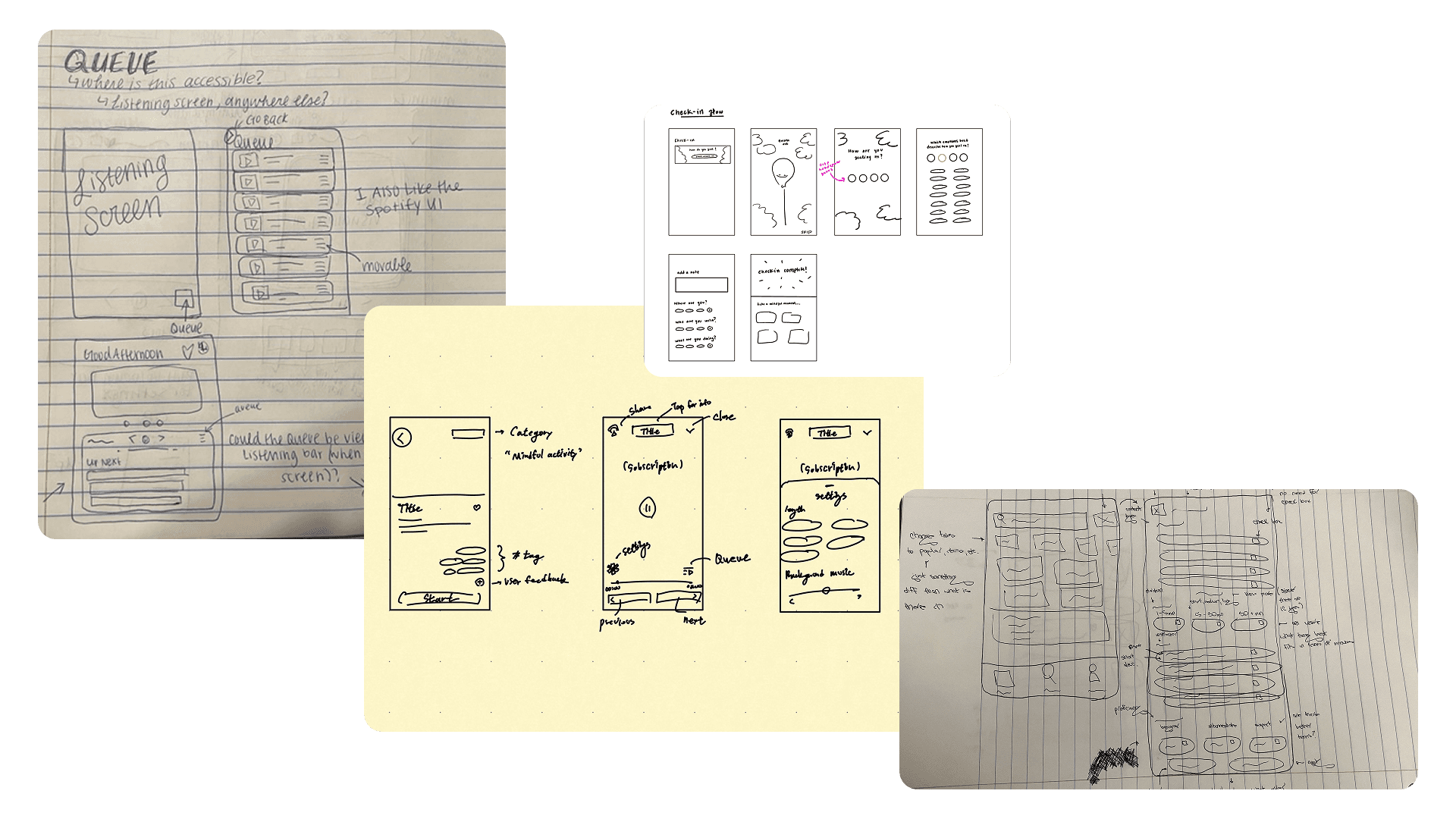
Sketches
We conceptualized our feature ideas through sketches. To decide which designs to move forward with, we used dot voting.
Mid-Fi Wireframes
After rounds of internal and external feedback, we created over 50 screens to begin our proof of concept. Here are a few screens from this phase of our design process.


04: Bringing it Together
Our Recommendations
Click through our presentation to see our final design recommendations.
Prototype
Follow the blue highlighted areas to click navigate our prototype. For the best experience, please interact with the prototype in full screen.

