UX Research, UX Design
Illinois App Extension
Project Overview
The Problem:
Students take course planning seriously because of its large role in their career development and college experience. The current course registration website is outdated and counterintuitive, which makes this process more time-consuming and stressful.
The Solution:
The Illinois App provides campus resources and services for University of Illinois students, faculty, and staff. In our research, we found that students prefer one centralized app for their needs, so we focused on adding functionality to an existing platform.
Timeline:
October - December 2022
Role:
UX Design, UX Research
Team:
Pranav S., Helen, Maddie, Rijha, Pranav C.
The Guiding Question
How might we facilitate course registration processes for University of Illinois students?
Our Proposed Solutions
Notifications
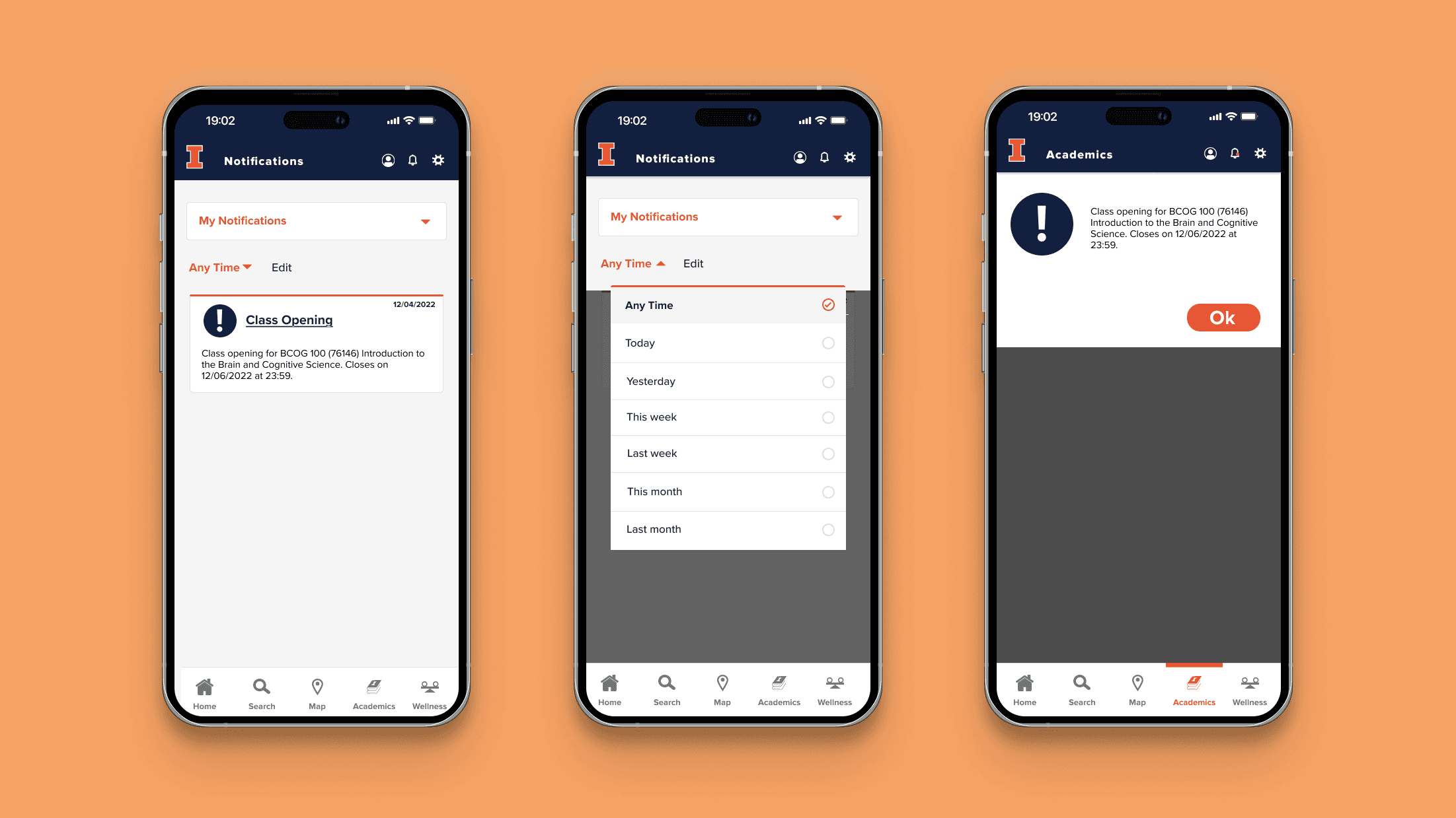
The notifications feature lives in the Illinois App, but it is not currently being used. We found that students utilize email notifications to learn when classes open up. However, since students are constantly bombarded with emails, we thought that notifications would be the perfect opportunity to get these messages across since students use their phone often.
Scheduling
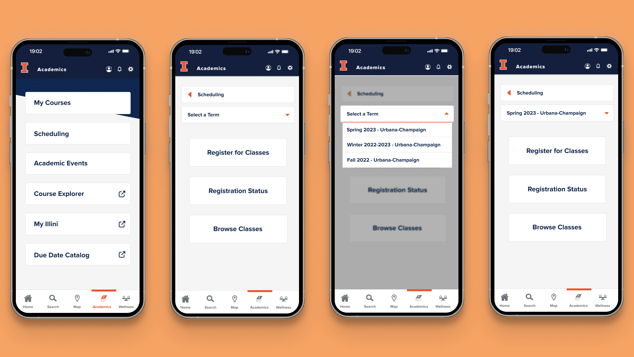
We found that there were no features that enticed sophomores, juniors, and seniors to return to the app. Freshmen primarily use the app to check their meal plan and the dining hall menu. Therefore, we added the “Academics” tab to the Illinois App to draw more students in. Since registration is a campus-wide requirement, we felt that supporting features would help bring more traffic.
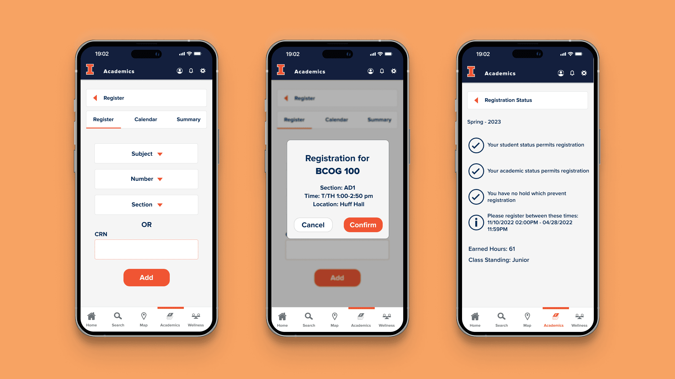
Registration
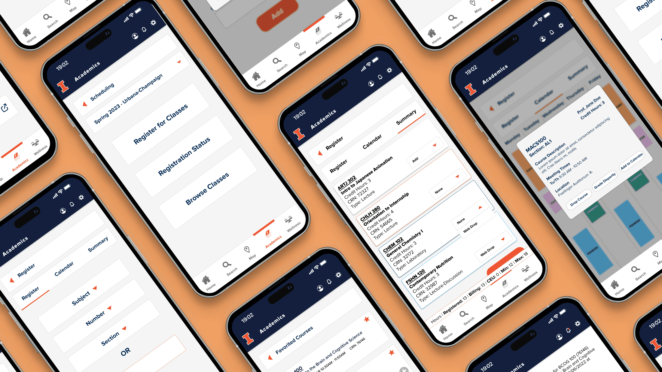
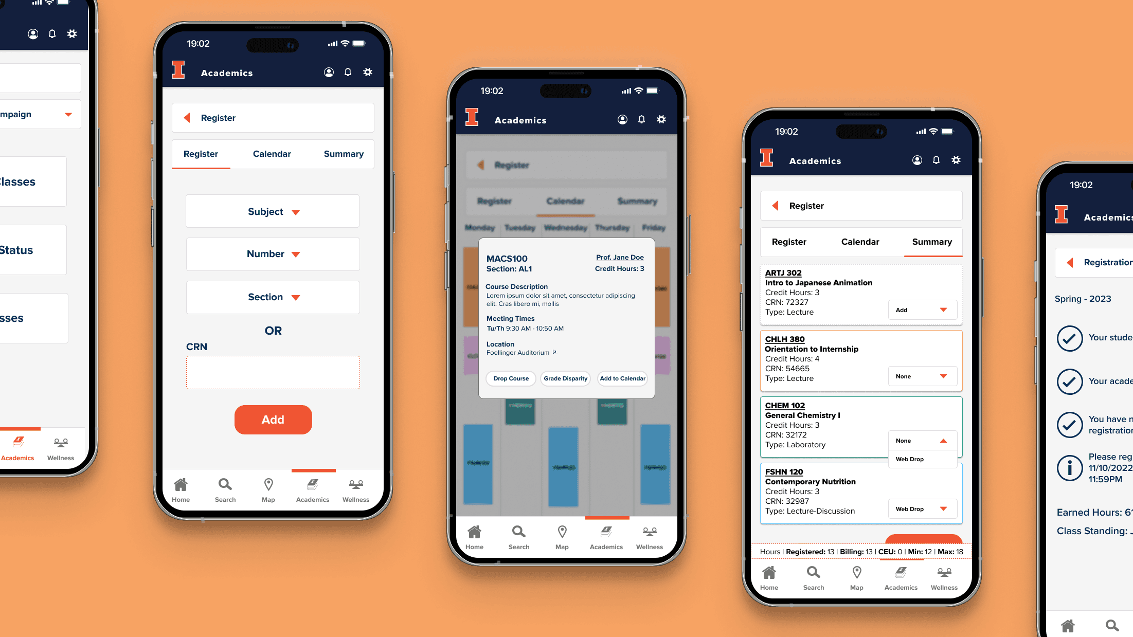
From our interviews, we found that students have a difficult time navigating the existing registration website. It required too many inquiries to find a single course. We decided to simplify the interface to only require the course subject, number, and section OR the unique course registration to ease these outstanding frustrations.
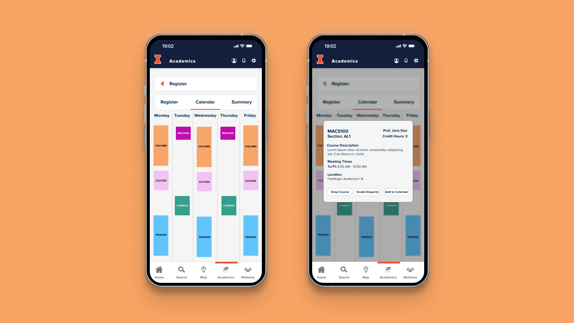
Viewing Registration
Students carefully plan their courses because it shapes their daily schedules. In order to help students visualize their classes, we included a calendar view. However, students wanted access to quick overview of their registration, so we created a summary tab that includes total hours registered and billed.
So how did we arrive here?
01: Preliminary Research
We wanted to better understand student motivations behind course selection, so we considered how students plan their schedule, how students register for courses, why students choose their classes, and which resources they consult.
After conducting 12 user interviews with UIUC students across different majors, localities, and class standings, we analyzed the data from three perspectives: satisfaction, familiarity, and desires.
Through affinity diagramming and discussion, we identified four main insights:
Students complete thorough research by referring to friends, grade disparity visualizations, and Rate My Professors.
Students consider content, professor, grading, and credit hours in class selection.
The current registration website is uneasy to navigate due to misleading pages and tabs.
Students would like a visually condensed resource with access to other information streams.
With this in mind, we crystalized our learnings in the form of user personas to hone in on the human-centered aspect of design. We did not want to lose sight of our user audience throughout the process moving forward.
02: Ideation
Challenge 1: Simplifying the complexity within course registration
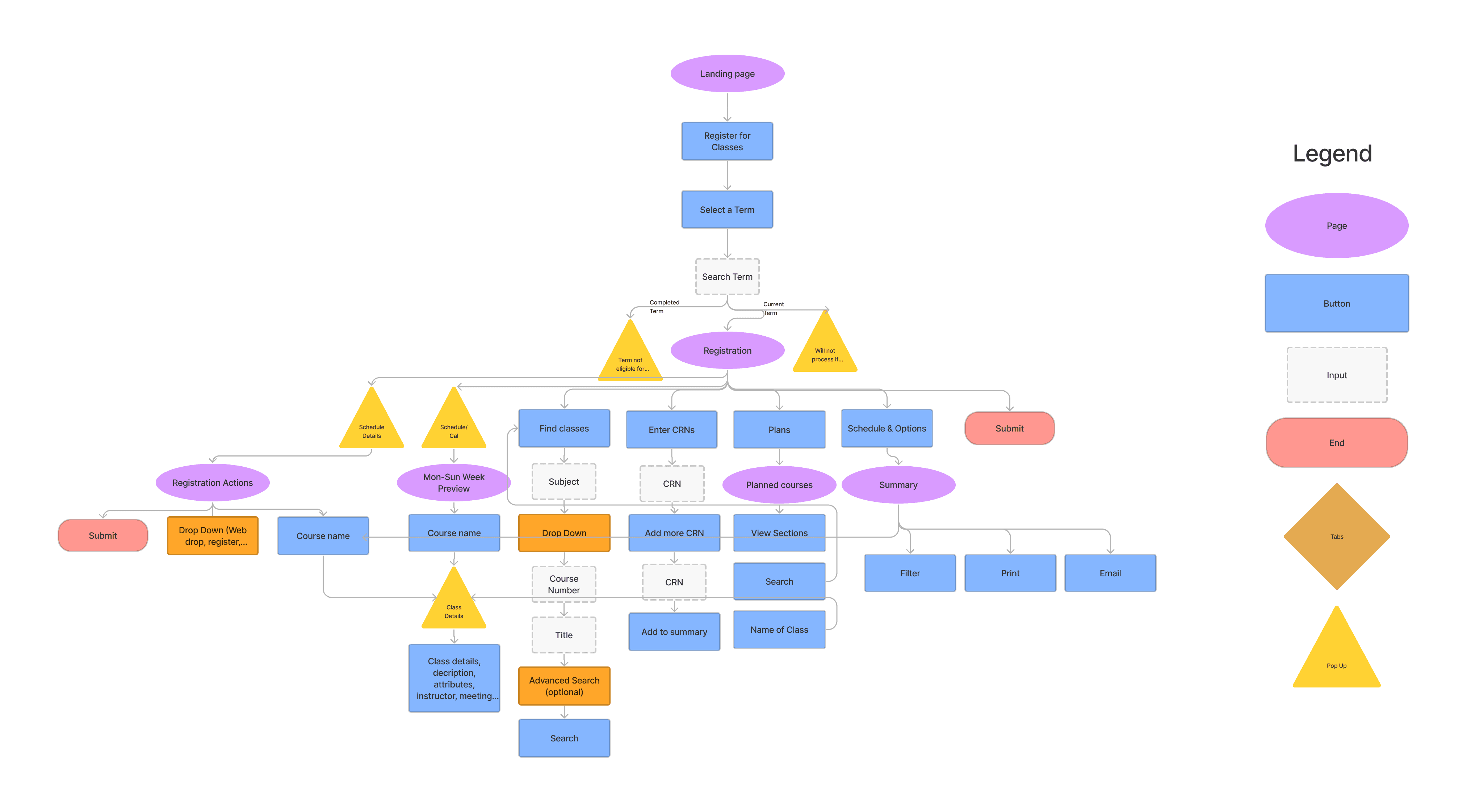
This is the information architecture based on the existing website for University of Illinois course registration. Our interviewees voiced that the course planning and registration was not straightforward. For example, many input fields are redundant because there are many ways to identify a single class: course registration number, course subject and number, course name etc. Consequently, we made user expectations and navigation clear in our designs early on.
Challenge 2: Adapting to the layout constraints on mobile
There are different affordances and limitations when comparing web and mobile interfaces. Because mobile interfaces are inherently smaller, we needed to balance opposing values: information concision and information depth.
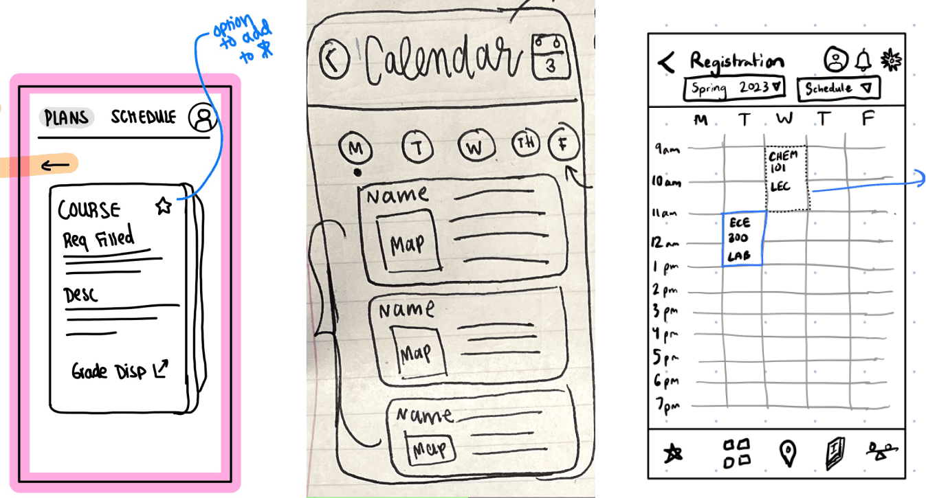
As such, we experimented with different layouts and interactions to see how we could best incorporate detail. We generated over 50 sketches, narrowing them down by critically reflecting on accessibility and usability concerns.
Challenge 3: Evaluating how the features work together
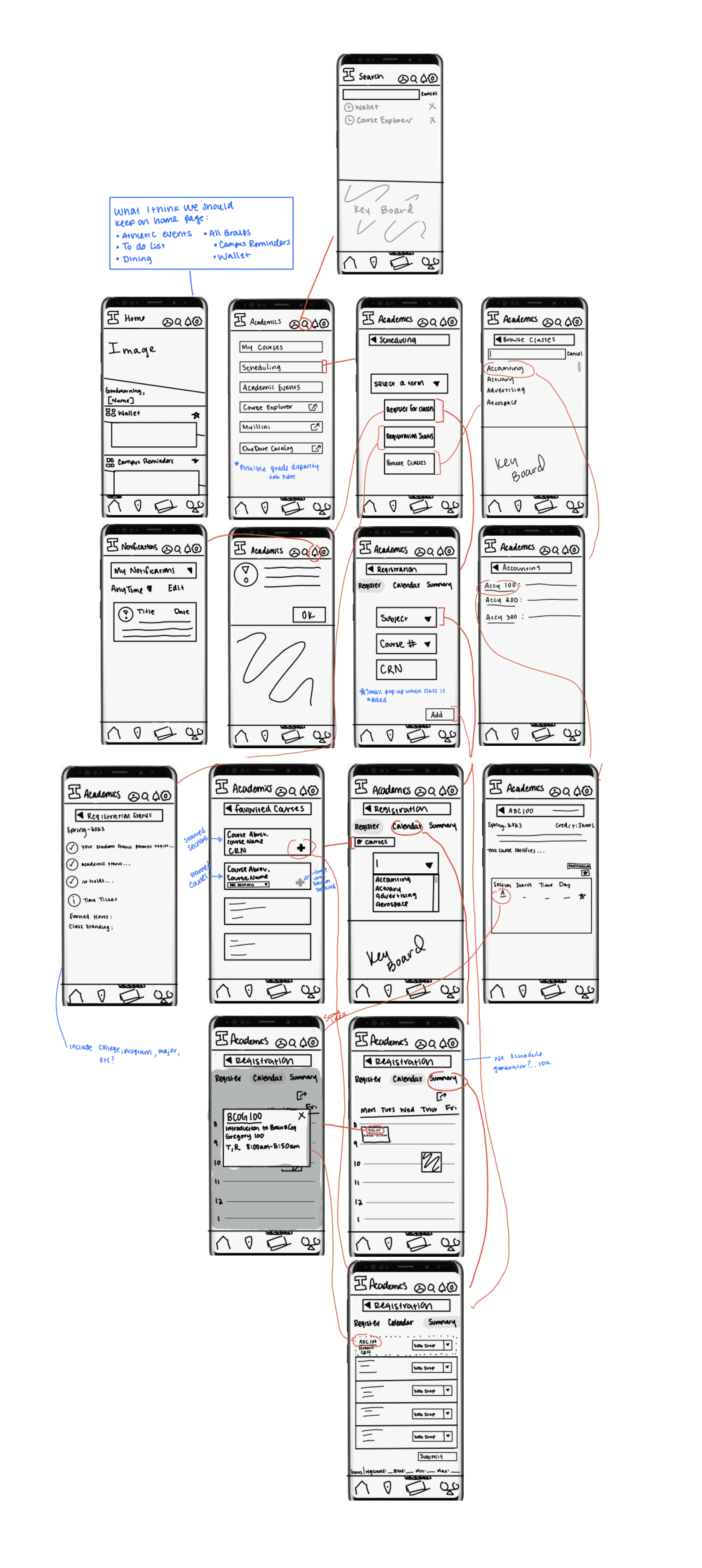
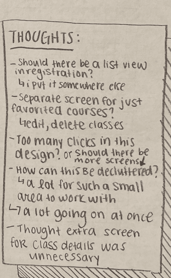
There is no doubt that course registration has many moving parts. After we decided on key functions and main layouts, we heavily analyzed users flows to ensure that students could navigate to all features.
Here are some of my notes from one of our internal usability evaluations on the left.
03: Adding Fidelity
Translating Sketches into Lo-Fis
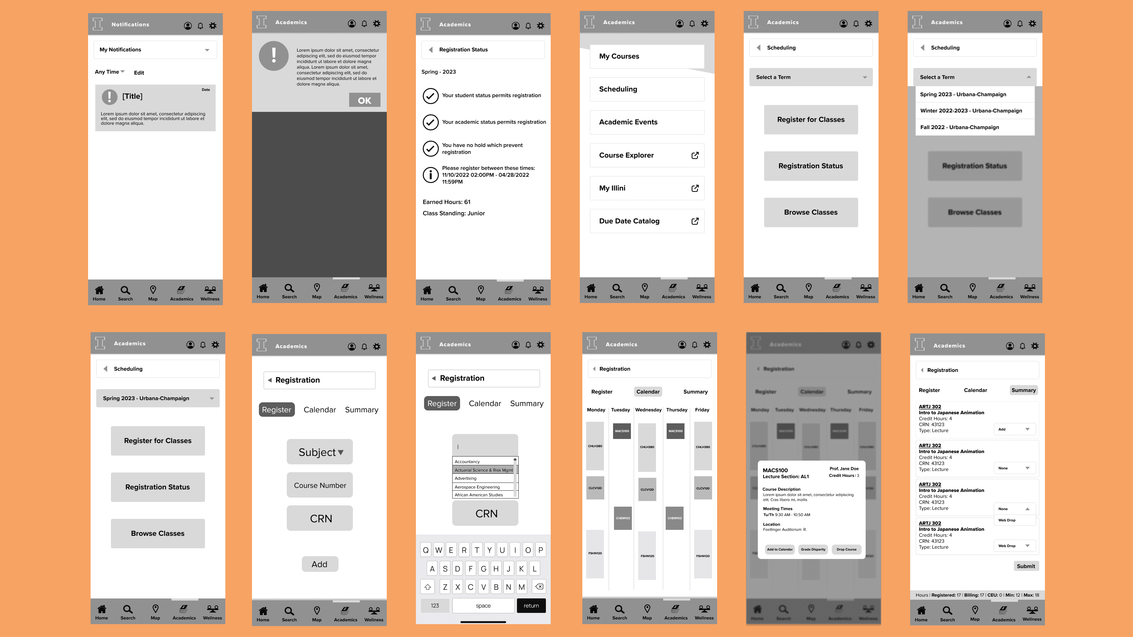
Here are some of our low fidelity designs based off of feedback from our sketches. From the discussions from our paper prototypes, we made adjustments to make functionality and navigation more clear and intuitive.
Updating the Design Language
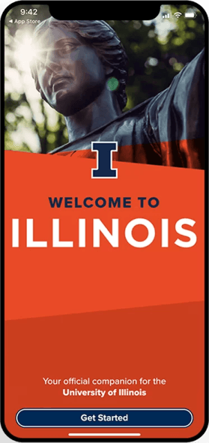
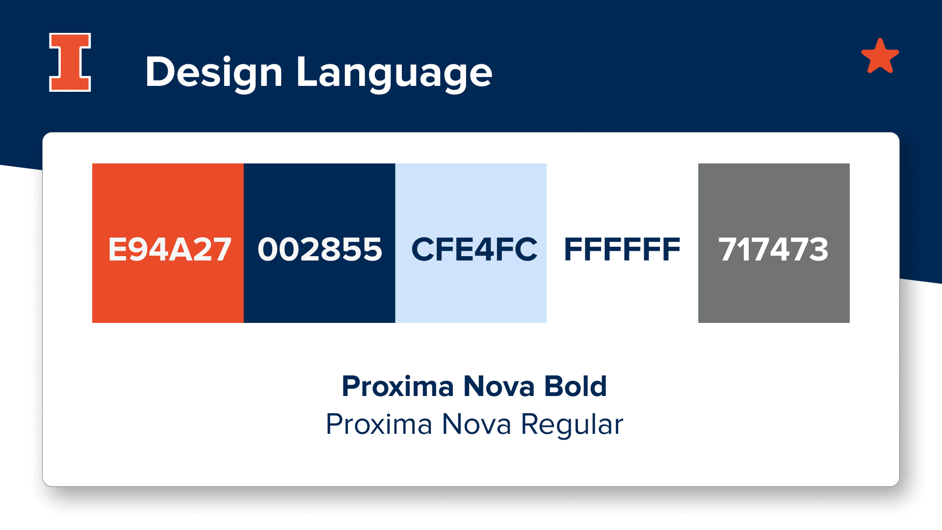
In our initial pain point audit, we noted that users were frustrated with the user interface of the course registration website. The dated graphic design of the website furthered the negative experience of course registration.
As such, we implemented the design language of the Illinois App as it is sleek and modern. We maintained the same font, so our designs would integrate more seamlessly into the existing app. It uses the University of Illinois branding colors, but we did add colors for flexibility with secondary and tertiary components. By adopting the design language of the Illinois App, we make key stakeholders more receptive to our proposals.
Reflections
Next Steps
Due to time constraints, we were not able to conduct user testing on our final high-fidelity designs. As such, I would like to further build upon the Illinois Extension by collecting data from usability testing to see how users might interact with our proposed features. This would include recorded timed tasks and think aloud interviews. This would allow me to identify weaknesses in the design to improve upon in the next iterations. I would also like to add help documentation for this functionality to support struggling and confused users.
Takeaways
It was scary to take a leap of faith and switch from the pre-med path to the product design industry, and I can say now that I have no regrets! This was my first UX design project, and it made me fall in love with the process of human-centered design. I would like to extend my gratitude to Design Innovation Illinois for supporting me on my user experience design career. It was comforting to work with a team of first-time designers, as we could bond over struggles together.
